• blog
  • in the shadow of sun mountain
  • buy my books
  • photographs
  • paintings
  • bio
  • cv
  • contact
  • search
Menu

Studio Q Photography

Exploring Human Behavior and Death Anxiety Through Art
  • blog
  • in the shadow of sun mountain
  • buy my books
  • photographs
  • paintings
  • bio
  • cv
  • contact
  • search
×

“Three Magic Dogs in the Rocky Mountains of Colorado,” 10” x 10” (25,4 x 25,4 cm) RA-4 Reversal Direct Color Print, August 15, 2023.

The Tabeguche-Ute were skilled horsemen. They were the first to get horses from the Spanish in the 17th century. They called horses “magic dogs.”

Don't Worry About Other People's Opinion of Your Work

Quinn Jacobson August 23, 2023

Over the past few weeks, I’ve had a few conversations with people about making art. One topic seemed to always come up in these chats. In essence, they ask or imply, “What if people don’t like what I do or don’t understand it?” Or even, “People don’t like what I do, and they don't understand it. I don’t get very many likes or comments on social media.”

Addressing the issue of people not liking or responding to your work (social media “likes” and “comments") can be a big deterrent. And it can be a bit depressing and frustrating too. But that’s only if you give it credence or value. It’s your choice, whether you do or not. I can say with some certainty that it’s a waste of time to be concerned with what other people think about your creative endeavors, whether on social media or not; their feedback, for the most part, is meaningless. There’s an old quote attributed to a lot of different people that says, "When you’re 20, You care what everyone thinks. When you’re 40, You stop caring what everyone thinks. When you’re 60, You realize no one was ever thinking about you in the first place." I’ll be 60 years old soon and can relate to the wisdom here. Apply it to your creative life. It will make you a better artist.

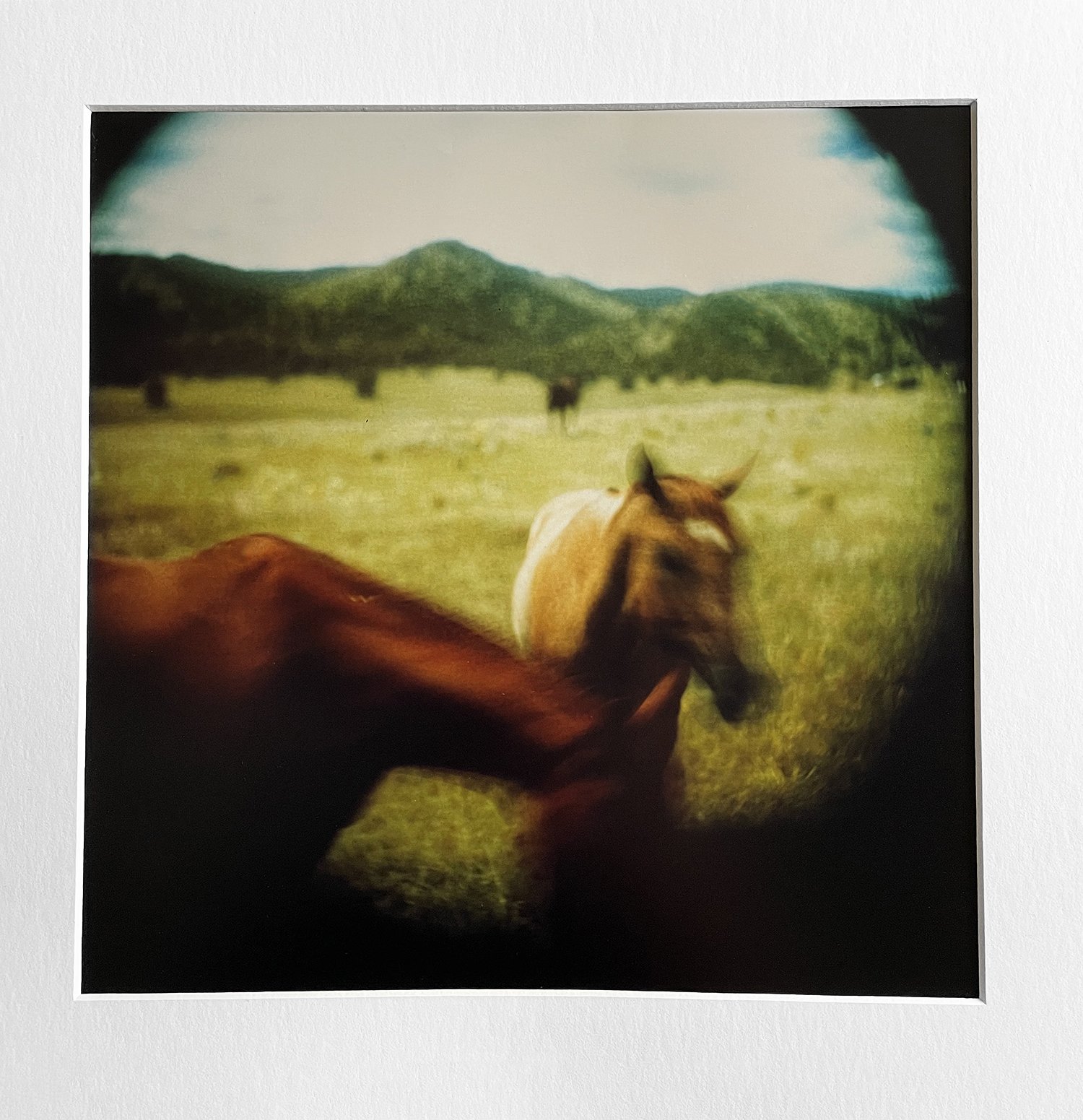
This is looking west-southwest from our house. We were walking back from the top of our property and saw this. The “circle” of clouds and the ray of light on Saddleback Mountain (the far peak) were magnificient.

My response to this dilemma has always been the same: Make your work for an audience of one: YOU. That’s all that matters. This only applies if you’re making personal, fine art work. Commercial work is a different story. With that, you are bound to please a much larger audience, and it’s in pursuit of money (that’s its purpose). It’s very easy for me to separate the two. Personal work has a strong, compelling narrative. Commercial work pays no mind to that. It’s pretty and popular. It’s a transaction for money, not an expression of an idea, concern, question, interest, etc. What the masses want is something familiar and safe. Something that takes no chances and is rarely ever different. It’s what sells. Money is the object, not expression. Period. Remember the difference; that’s an important piece of understanding what you’re trying to do.

“When you’re 20, You care what everyone thinks, When you’re 40, You stop caring what everyone thinks, When you’re 60, You realize no one was ever thinking about you in the first place.”
— Unknown

That brings me to my second point. If you make creative work with the intention of selling it, you’re probably off to a dubious start. Influence is incessant. Making money can really mess with accessing your own creative desires. You can see how easily you’d cross that line into commercial work. And once you cross over, you’re not making work for yourself; you’re making work for them. It kills your creative vibe (in a personal sense).

I’ve said it a million times: I have nothing against commercial work. Good on you if you do it and it fills your bank account. My concerns are about not conflating commercial work with personal expression, narrative, or personal fine art. I couldn’t care less for commercial work. I have absolutely no interest in it. I’m not in the least bit concerned about selling, showing, winning awards, or anything else with my work. I make it for personal reasons, reasons that I’ve explained many times in these essays.

Carry on doing work that motivates you. If others like it or can appreciate it, great! But never make that a priority. And I would recommend that you separate making money from your creative life. Keep your creative spirit free from the poison of commerce. It destroys your soul in that context. Earn your money some other way; keep your artmaking separate and special. Enjoy every day that you can create something, or even try to create something. Reveal the failures, learn from them, and be grateful. You will be amazed at where you find yourself mentally and creatively.

In the next few weeks, I’ll share what I’ve been working on in the studio. I guess you could call it an evolution of this work. I’m super excited about it. Stay tuned!!

In Art & Theory, Color Prints, New Book 2023, Project Work, Quinn Jacobson, Quinn's New Book 2024, RA-4 Reversal Positive, Shadow of Sun Mountain, Magic Dogs Tags In the Shadow of Sun Mountain, Qunn Jacobson, Magic Dogs, Rocky Mountains Colorado, RA-4, direct-color positive prints
Comment

“Cactus People” May 14, 2023, 10” x 10” (25,4 x 25.4 cm) (Made in camera, no negative) RA-4 Reversal Color Direct Print I used my Derogy (1864) Petzval lens for this image. I’ve made hundreds of portraits with this lens. A friend gave it to me on a visit to Glasgow, Scotland, in 2009. It's been one of my favorite lenses for working with historic photographic processes—very painterly and full of memories and experiences, it’s the perfect optic for this work. I called this image “Cactus People” because I see two “heads” fighting against the backdrop of a fire. It appears one has the advantage; maybe a blow or a strike took the other one down.

The Influence of Color

Quinn Jacobson May 15, 2023
“in·flu·ence (noun) the capacity to have an effect on the character, development, or behavior of someone or something, or the effect itself.”
— Oxford Dictionary

I love paintings. I always have. I’ve said many times that I’m a "frustrated painter." I’ve always said that one day I'd learn to paint. That may still happen. For now, I’m exploring the emotional influence that color prints bring to my photographic work (In the Shadow of Sun Mountain). The "vibration" of color, to use Marc Chagall's term, influences and moves me more as I produce more prints. I see it and, moreover, I feel it.

As I work through my ideas, I find what I’m attracted to is the "life vibrations," or the depth of life, that the colors bring to the subject matter. In other words, there is a poetry or feeling that they give where the monochrome fails. As an artist, you’re always searching for the right tool to use to make your work successful. The color prints are the correct tool for this work. I’m convinced.

“Cactus People With Water Vessel” May 14, 2023, 10” x 10” (25,4 x 25.4 cm) (Made in camera, no negative) RA-4 Reversal Color Direct Print I used my Derogy (1864) Petzval lens for this image. The beautiful fall-off, or depth of field, is like a half-remembered dream.

Working in the RA-4 reversal process has given me a lot of new ways to approach making photographs, too. The paper is quite “fast” (ISO)—I rate it at ISO 6 or 8 with the filter pack I’m using. That means I can work at times of the day and early evening that I was never able to with wet or dry collodion, let alone paper negatives. Also, I can “stop down” my lenses to gain depth of field and still manage to make exposures in seconds, not minutes. This opens an entirely new world for me. That’s very exciting, and I’m looking forward to the summer here and making this work come alive!

I see how this project has evolved over the two years I’ve been working on it. And I hope it will continue to evolve. I stay open and aware of that. For me, it has two layers: the personal exploration of our denial of death and terror management theory. This is the foundation for telling the story of the Tabeguache Ute, what happened to them here, and, more importantly, why it happened.

The second layer is more abstract, concerning poetry, beauty, and the life-affirming examination of mortality. For me, this is the perfect narrative. I have “skin in the game," given my preoccupation with marginal communities and the psychology that drives human behavior. And I have a love of the mystery of life and how beautiful it can be. My objectives have nothing to do with “self-help” or offering to analyze people’s lives through these psychological theories. It’s more about sharing my self-awareness and what that means for me. Also, there is a big part of it that is based on how these theories have driven human behavior and historical events. In the end, it’s both historical and personal, terrifying and beautiful. I feel like the color component helps me translate these kinds of concepts better than monochrome work. It elevates both the work and the concepts.

“Awe, humility and gratitude effectively mitigate death anxiety.”
— Sheldon Solomon

Color is now a primary tool for me to communicate the nuances and beauty of the place where I live. Through the color, I can talk about the history and events that took place here with a subtlety that I didn’t possess before. I know now that I’ll start (and have already started) incorporating visual ideas that represent the concepts of consciousness, death anxiety, awe, humility, and gratitude. I want to show how facing the existential anxieties that we all have can be resolved (or at least managed) through deeply reflecting on yourself, having true self-awareness, and being authentic.

Life is both beautiful and terrifying—that’s the paradox we face. Choosing to be death-forward (in the words of Heidegger) and working toward that horizon of opportunity to have a “turning” in your life is the goal. We will never be free from death anxiety. It will always be there. We can, however, learn to be in awe, be humble (not self-deprecating but understanding your position in the universe), and most of all, be grateful and have gratitude for life. It will end, no doubt, but we can strive toward being thoughtful, self-aware, open, and honest every day. Like Socrates said, examine yourself, be honest, and move toward the good.

“The bottom line is this: Terror Management Theory may seem like a dark and depressing topic, but it can actually shed a lot of light on the ways that we as humans strive to find meaning and purpose in a world that can sometimes seem bleak and meaningless. By understanding the ways that we cope with our mortality, we can begin to develop more positive and life-affirming strategies for dealing with the existential terror that is an inevitable part of the human experience.”
— Mark Manson

“Cactus People With Water Vessel” May 14, 2023, 10” x 10” (25,4 x 25.4 cm) (Made in camera, no negative) RA-4 Reversal Color Direct Print I used my Derogy (1864) Petzval lens for this image. I’ve made hundreds of portraits with this lens. I can control color with exposure—the length of exposure will warm or cool the image color. Absolutely amazing!

In Art & Theory, Books, Color Prints, Death Anxiety, Denial of Death, Ernest Becker, Glasgow, Martin Heidegger, New Book 2023, Nietzsche, Philosophy, Psychology, RA-4 Reversal Positive, Scotland, Shadow of Sun Mountain, Sheldon Solomon, Tabeguache Ute, Terror Management Theory Tags color, direct-color positive prints, Martin Heidegger, awe, humility, gratitude, RA-4
2 Comments

“European Silver, Cactus, Quartz, and Blue Grama Grass” May 5, 2023, 10” x 10” (23,4 x 23, 4 cm) RA-4 Reversal direct color print.

RA-4 Reversal Color Prints

Quinn Jacobson May 6, 2023

After 20+ years of working with wet and dry collodion (all variants), plus calotypes, daguerreotypes, and all of the P.O.P. processes you can imagine and some you can’t, people have asked why I’m working in color now. It’s a good question, and it's more than fair to ask why the big change—I’m happy to answer it.

If you’ve followed my journey on this project (“In the Shadow of Sun Mountain: The Psychology of Othering and the Origins of Evil"), you’ll know I’ve spent a lot of time connecting the craft to the concept. Throughout that discovery process, I felt something was lacking but couldn’t put my finger on it. Over the winter, I had a lot of time to write and think about what I'd been doing. What I discovered was that I’d been missing the beauty here; it was lacking in the photographs. Please don’t misunderstand me. I have some gorgeous negatives and prints in wet and dry collodion as well as paper negatives and prints. However, as I lived with them and looked at them over and over, I couldn’t help but see that they didn’t fully represent this gorgeous place where I live.

“Color is all. When color is right, form is right. Color is everything, color is vibration like music; everything is vibration.”
— Marc Chagall

How do you resolve that problem? For me, it was making work in color. I’ve written before about trying to paint the prints with watercolor, etc. It’s not the same. As I wrote my biography for my book, I wrote about the first photographic exhibition I had: polaroids. Gorgeous color, a little off with the color (like expired film), and very manipulated. Look up Lucas Samaras. This inspired me to go back to my “color days” in photography to resolve the “beauty” problem. I really enjoyed shooting Kodachrome and making Cibacrome (Ilfochrome) prints from the 35mm positives. I had experimented with direct color positives then too. So I revisited that, and here I am. This has been a boost for my creativity, and I’ve just started. You’ll see, over the spring and summer, what I do with this. It opens a lot of new and exciting possibilities for me. I absolutely love it!

I’m interested in the idea of memory. It’s one of the four words I’ve always used to make work: identity, difference, memory, and justice. These words are like legs on a table that support my work conceptually. I’ve tried to semiotically mirror these in the photographs I make.

“Drinking Vessel, Cactus, and Dried Barley” May 5, 2023, 10” x 10” (23,4 x 23, 4 cm) RA-4 Reversal direct color print.

“Drinking Vessel, Cactus, Quartz, and Dried Barley,” May 5, 2023, 10” x 10” (23,4 x 23,4 cm) RA-4 Reversal direct color print The “aurora borealis” artifacts in this print are very interesting to me; just like in wet or dry collodion or even paper negatives, the artifacts in these prints can be very appropriate for the concepts I’m working with.

In Art & Theory, Death Anxiety, Denial of Death, Ernest Becker, Franz Kafka, New Book 2023, Philosophy, Project Work, RA-4 Reversal Positive, Shadow of Sun Mountain, Tabeguache Ute, Terror Management Theory Tags RA-4, direct-color positive prints, color quote chagall, In the Shadow of Sun Mountain, death anxiety, denial of death, Ernest Becker
Comment

“River Stump” RA-4 Reversal Color Direct Positive Print.

Surreal

Quinn Jacobson April 15, 2023

It was overcast the other day and just warm enough to get into the darkroom. I’ve been experimenting a lot with the direct color positive prints. So far, I like them a lot. As it gets warmer, I’ll push this process even more. There is a depth and beauty in these that’s not translating very well to the screen, but I wanted to show you the direction I’m going.

"I have a friend who's an artist and has sometimes taken a view with which I don't agree with very well. He'll hold up a flower and say, "Look how beautiful it is," and I'll agree. Then he says, “I, as an artist, can see how beautiful this is, but you, as a scientist, take this all apart and it becomes a dull thing," and I think that he's kind of nutty. First of all, the beauty that he sees is available to other people and, I believe, to me too. Although I may not be quite as refined aesthetically as he is... I can appreciate the beauty of a flower. At the same time, I see much more about the flower than he does. I could imagine the cells there and the complicated actions inside, which also have a beauty. I mean, it's not just beauty at this dimension, at one centimeter; there's also beauty at smaller dimensions, in the inner structure and the processes. The fact that the colors in the flower evolved in order to attract insects to pollinate it is interesting; it means that insects can see the color. It adds a question: does this aesthetic sense also exist in the lower forms? Why is it aesthetic? All kinds of interesting questions, which the science knowledge only adds to the excitement, the mystery, and the awe of a flower. It only adds “I don't understand how it subtracts."

- Richard P. Feynman, The Pleasure of Finding Things Out

In RA-4 Reversal Positive, Shadow of Sun Mountain Tags RA-4, direct-color positive prints
Comment

“Blue Grama Grass (Dead) and Granite Stones,” 10” x 10” (25,4 x 25,4 cm), RA-4 Color Reversal Print an in-camera direct-positive made with an 1874 Derogy Petzval lens. April 7, 2023

The Evolution of a Body of Work (Photographs)-RA-4 Color Reversal Prints

Quinn Jacobson April 8, 2023

For years, I’ve talked about the evolution of making a cohesive body of work—communicating a strong, solid narrative with photographs that support the narrative. I’ve tried to communicate how important it is to have a plan, how plans change, and how to adapt and move forward.

It’s important to know when you are “on course.” The course changes all the time; it’s a moving target until it isn’t. I’ve emphasized self-examination, authenticity, and honesty. That’s how you find the target and move with it until it stops and you hit the mark.

Of course, everyone is different. We struggle and fight with certain problems in different ways. And sometimes, what one person perceives as a problem, the other person embraces as a supporting element. It’s much harder to do this than it seems. The evidence is that very few people do it, and even fewer are really successful at it. For me, these ideas are at the core of making art, and I’m always working toward them.

The winter is ending here in the Rocky Mountains of Colorado (finally!). It’s been long and cold. The good part about that is that it’s given me a lot of time to write, research, and think. I’ve realized that making images constantly (all year long) might not be a good thing for me. I need a pause. I need time to evaluate, to ponder, and to deeply think about what I want to do and what I’m actually doing. I used to believe the work “revealed” itself as you made it, and you adjusted from there. That’s somewhat true, but you have to have something to evaluate it with—a matrix of some kind. Without that, you’re simply making “pretty, chocolate-box pictures,” again lost somewhere between the commercial world and the derivative or technical world. If your goal is fine art, those are not places you want to be.

I’ve had several changes over the past 18 months on my project, “In the Shadow of Sun Mountain: The Psychology of Othering and the Origins of Evil.” It started as a look at the Tabeguache-Utes that once occupied the land I live on, visually representing their land and their history. Then it evolved into a closer look at the events that drove them off of their lands and into prisoner of war camps (aka reservations). And now, it’s a full-on examination of the role of death anxiety and terror management theory—an examination of how these theories have driven human behavior and what it did to the Tabeguache-Ute and all of the other people throughout history that've suffered atrocities.

Ernest Becker was a cultural anthropologist and author who wrote extensively on the human condition and the nature of evil. According to Becker, the cause of evil in the world is rooted in the human condition itself. He believed that human beings are uniquely aware of their own mortality, which creates a fundamental sense of anxiety and dread. To cope with this anxiety, individuals create symbolic systems of meaning, such as religion and culture, which provide a sense of purpose and significance to repress existential terror (death anxiety). However, these symbolic systems can also lead to conflict and violence as individuals and groups become attached to their own particular worldview and seek to defend it at all costs. This can result in acts of aggression, oppression, and even genocide. That’s where I’ve been for a while with this work.

And now, the project takes another step toward its final form. Several months ago, I purchased a nice (French) watercolor set from an art store. I wanted to incorporate two things into the photographs: a painterly look and the beauty of this place, as abstract as that may be.

In reality, I’m more interested in revealing and celebrating the beauty here than anything else. I’ve always said, “I’m a frustrated painter.” And the idea of a painting—pre-photography—is appealing. A painting is a one-off, meaning it can’t be reproduced (copied, yes, but never another original). I’ve always embraced that about tintypes and ambrotypes. There is something very intriguing about having “only one”—a lot like human beings themselves, there is only one of you! That’s a wonderful and beautiful thing.

I’ve always liked a quote from the movie Beware of Images: "We live in an age of hyper-reality, where the authentic is gradually being eclipsed by its endless representations, where every new layer of mediation stands between us and the natural world, where forgeries have so viciously attacked the original that they now reign victorious in its place, and as the forgeries themselves are relentlessly replicated, we are left with infinite simulations of that which never existed." I can relate to this idea on many different levels. Look at AI, social media, etc. We’re in an Orwellian nightmare when it comes to this topic and how it’s affecting art and authenticity.

So, I want to incorporate color into this work. I was looking at some of my flora (plants) prints and lamented that the beautiful colors of the bright yellow Sneezeweed, the white-purple Slender Tube Skyrocket, the bright red of the Prairie-Fire, and the vivid purple of the Rocky Mountain Geranium weren’t there. It felt wrong. The landscapes here are gorgeous, but a lot of the time the wet and dry plate processes simply don’t capture that, nor do the paper negative or POP processes. They are beautiful in their own way, but I feel like I’m after something else.

“Blue Grama Grass (Dead)” 10” x 10” (25,4 x 25,4 cm), RA-4 Color Reversal Print an in-camera direct-positive made with an 1874 Derogy Petzval lens. April 7, 2023

Here I am with a watercolor set and POP prints. That won’t work either. It takes a skill set that I don’t possess. Maybe one day, but not for this. Now what?

In 1993, I had my first photographic exhibition. I transferred about 25 Polaroid pictures (manipulated) onto 6x6 and 8x8 cotton and linen paper; each photograph was accompanied by a poem communicating something about the human condition and the paradox of existence and consciousness.

The colors were crazy and worked very well for the narrative. The show was called “Visions in Mortality.” I wrote a lot about it in my new book because the influence of that show is affecting this work in a major way.

Now, over 30 years later, here I am again, asking questions about mortality and feeling nostalgic. This desire goes far beyond my connection with the original work in 1992. I want the elements in this work to esteem this place, to lift it up, and to show how beautiful it is—the only way I feel that can be accomplished is through color prints.

I dug in my quiver and found an arrow that points me back 30 years, back to my days in undergraduate school and processing reversal film (E-6), C-41, Cibachrome printing, and making C-Prints. It rang true for me to get back in the saddle and work this out.

Another thing that really pushed me toward this was after I watched Nan Goldin’s documentary, "All the Beauty and All the Bloodshed." The work of Goldin, Eggleston, and Samaras has had a big influence on me. Their work and style will be apparent in what I’m doing, but with my signature.

I’ve started making RA-4 reversal prints—color direct-positive prints. These are 10” x 10” (25.4 x 25.4 cm) and made with a Petzval lens. I have to color-correct, of course. The paper is tungsten-balanced (3200K), and I’m making images in 5600K–6000K+. There’s a learning curve, and nothing ever seems to be consistent. Oddly enough, I kind of like that. I want some serendipity in all of it; I’m not a machine, and I don’t want this work to look like a machine made it.

The technical isn’t important at this point, and I won’t be sharing a lot of the images, but I wanted to share what the evolution of this project looked like almost two years into it. And I might even offer to not think of yourself as “married” to a certain process or even photography itself. Allow the narrative to drive and support the medium.

Color photography has the power to convey a wide range of emotions and moods, as well as the beauty and complexity of the world around us. While black and white, or historic processes, have a classic and timeless appeal, the use of color can add an extra dimension of creativity and expression to a photographic work.

One way to think about the creative use of color in photography is to consider how different hues can be used to create a sense of mood or atmosphere. For example, warm colors like reds, yellows, and oranges can create a sense of energy and excitement, while cooler colors like blues and greens can evoke a feeling of calm and tranquility. By playing with the balance of colors in a photograph, an artist can create a sense of tension, harmony, or contrast that can add depth and meaning to the work. In other words, there is a lot to play with when using color. A wider palette of visual opportunities

Another way to think about color in photography is to consider how it can be used to draw attention to certain elements or aspects of the image. By using a bold or contrasting color in a particular area of the photograph, an artist can create a focal point that draws the viewer's eye and adds emphasis to that part of the composition. This can be especially effective when combined with other creative techniques, such as selective focus or composition, to create a sense of depth and perspective.

Overall, the creative use of color in photography can be a powerful tool for an artist looking to express themselves and capture the beauty and complexity of the world around them. By experimenting with different hues, tones, and shades and considering how color can be used to create mood, emphasis, and depth, an artist can create stunning work that's both beautiful and meaningful.

In RA-4 Reversal Positive, Direct Color Prints Tags creating a body of work, direct-color positive prints, RA-4 Reversal Direct-Positive Printing, RA-4
2 Comments

Search Posts

Archive Block
This is example content. Double-click here and select a page to create an index of your own content. Learn more
Post Archive
  • Photography
 

Featured Posts

Featured
May 12, 2025
Giving A Print With Every Book
May 12, 2025
May 12, 2025
May 9, 2025
Between Being and Ending: The Existential Significance of Art in a Finite Life
May 9, 2025
May 9, 2025
May 4, 2025
Ocotillo
May 4, 2025
May 4, 2025
Apr 25, 2025
Thinking About Doctoral Studies and V.2 Automatic Fantastic
Apr 25, 2025
Apr 25, 2025
Apr 24, 2025
Automatic Fantastic
Apr 24, 2025
Apr 24, 2025
Apr 20, 2025
You're Neurotic: How Neurotic Are You?
Apr 20, 2025
Apr 20, 2025
Apr 17, 2025
What a 19th-Century Photograph Reveals About Power, Privilege and Violence in the American West
Apr 17, 2025
Apr 17, 2025
Mar 22, 2025
Update on My Book and Preparing for My Doctoral Studies (PhD Program)
Mar 22, 2025
Mar 22, 2025
Mar 7, 2025
Arundel Camera Club (Maryland) Talk
Mar 7, 2025
Mar 7, 2025
Feb 27, 2025
We Lost Moshe Yesterday to Cancer
Feb 27, 2025
Feb 27, 2025