THE GREAT MULLEIN (IN FLOWER)
Many tribes employed the use of mullein leaf tea for coughs, colds, and rheumatism. They considered it to be analgesic, anti-inflammatory, antispasmodic, and expectorant. The astringent and demulcent properties of the leaf tea were found useful in cases of diarrhea.
I’m working hard to dial in what I want to do when it comes to making my prints. I know I vacillate a lot on what I want these images to end up as; i.e. what kind of printing process I want to use and how they are presented in the end. It’s not a question of cost or time or anything that might be inconvenient. It’s simply a matter of aesthetics.
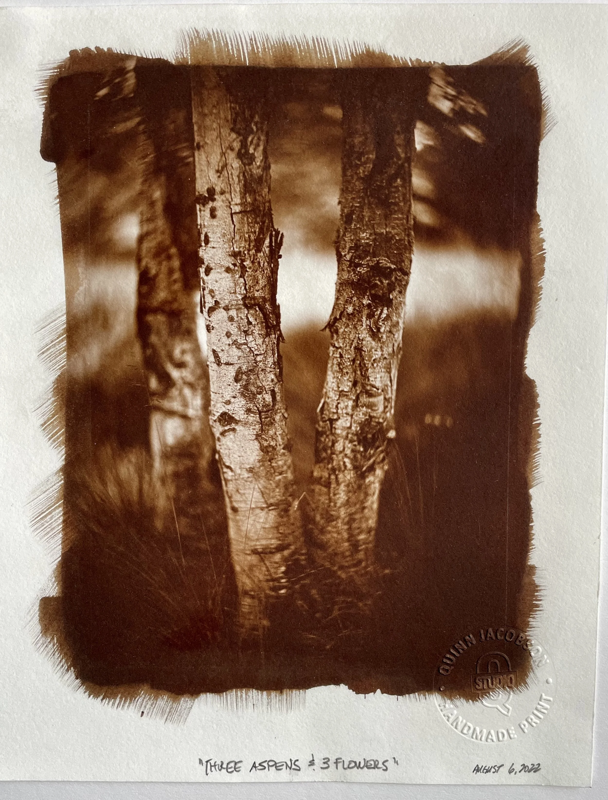
As of today, I think I’ve committed to the toned Kallitype print. The reason for this is twofold; first, and foremost the color, or color control. I am enamored with the red tones I can get. They are representative of this area, the Utes called this area, “Red Mother Earth.” And they really have a dream-like, historic quality.
Some of the prints I’ve made lately remind me of Edward Curtis’s POP prints. Warm and gorgeous. So, bottom line is that this workflow allows me to stay consistent and achieve what I want for this project. It goes to show that you always want to remain open in the discovery phase of a project. Being dead-set on something can really pull the work down and possibly even make it fail. When I started this project, almost a year ago now, I never thought I would end up printing toned Kallitypes from my negatives. Never say never!
You can start to see where I’m going with the work - although the printing processes are different, the matching and diptychs possibilities are there. The Aspen cut I photographed last week, matches up well with this image.
3 ASPEN TREES & 3 FLOWERS
Native Americans heavily relied on aspen, It was a great source of food, medicine, and wood for them. Many medicinal uses relied on the presence of salicin and populin, two precursors of aspirin that are present to some degree in all members of the genus Populus.
Aspen Tress - Looking East, Toward Tava (Sun Mountain)
ASPEN TREE
Native Americans heavily relied on aspen, It was a great source of food, medicine, and wood for them. Many medicinal uses relied on the presence of salicin and populin, two precursors of aspirin that are present to some degree in all members of the genus Populus.


