
As I get older, I find myself in direct opposition to “popular views”. In other words, when the crowds go to the right, I go to the left. That kind of thing. I tend to be the opposite most of the time. And I think for good reasons. I consider myself a rational and reasonable person. I try to think things through with reason and logic. And, as Socrates said, I try to “examine” myself on a regular basis. I try to critically think about my choices in life. For you spontaneous people, those are scary words. I know, but that’s how I’m built.
This theory, or approach to life, really applies directly to my art-making process. Photography specifically. I’ve talked a lot about having reasons for making certain choices when making art. So when it’s applied to photography I ask what processes, what formats, etc. I believe there should be good reasons, as personal as they may be, for every choice. Nothing should be random. I also believe you should be able to defend those decisions when questioned or challenged.
Lately, I’ve been thinking a lot about the format choice I’ve made for this current project (“In the Shadow of Sun Mountain”). After deciding to explore making a book, or books, of this work, I may end up making a format change too.
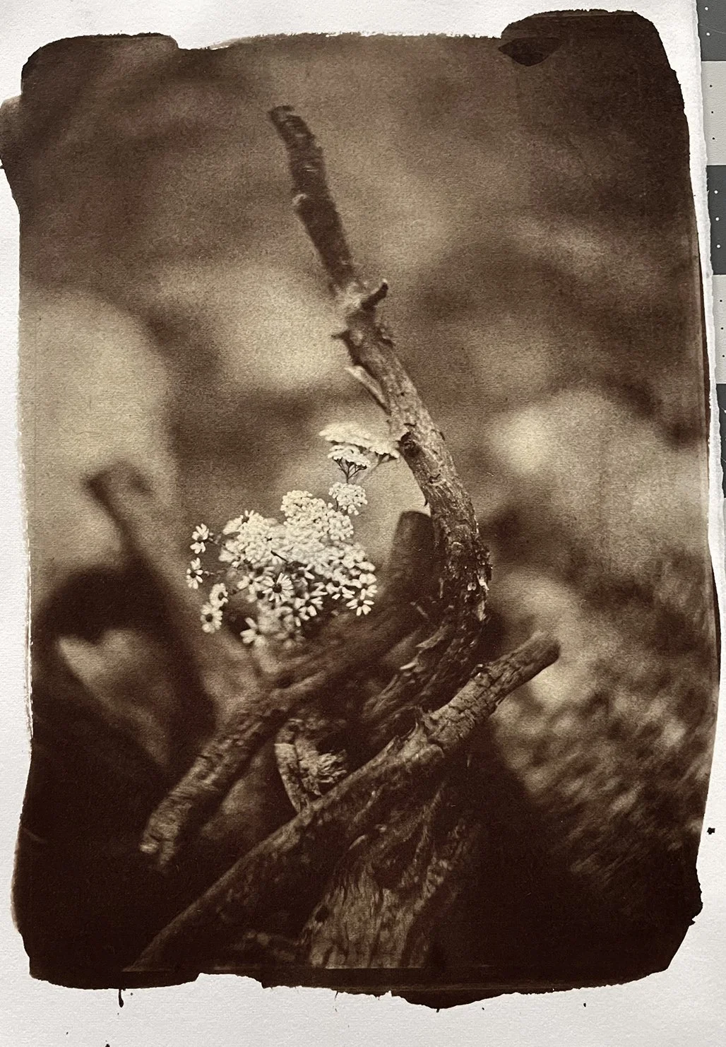
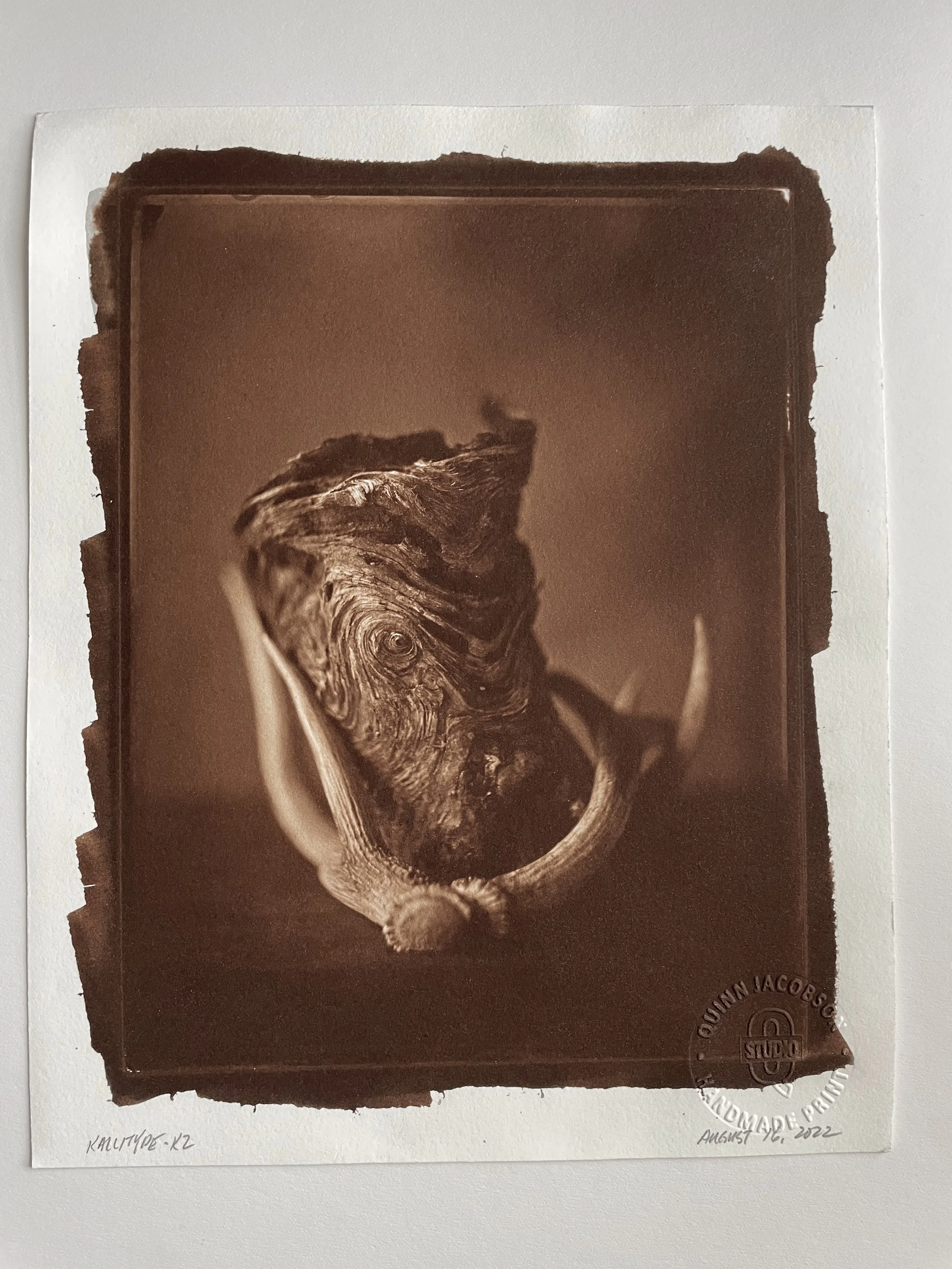
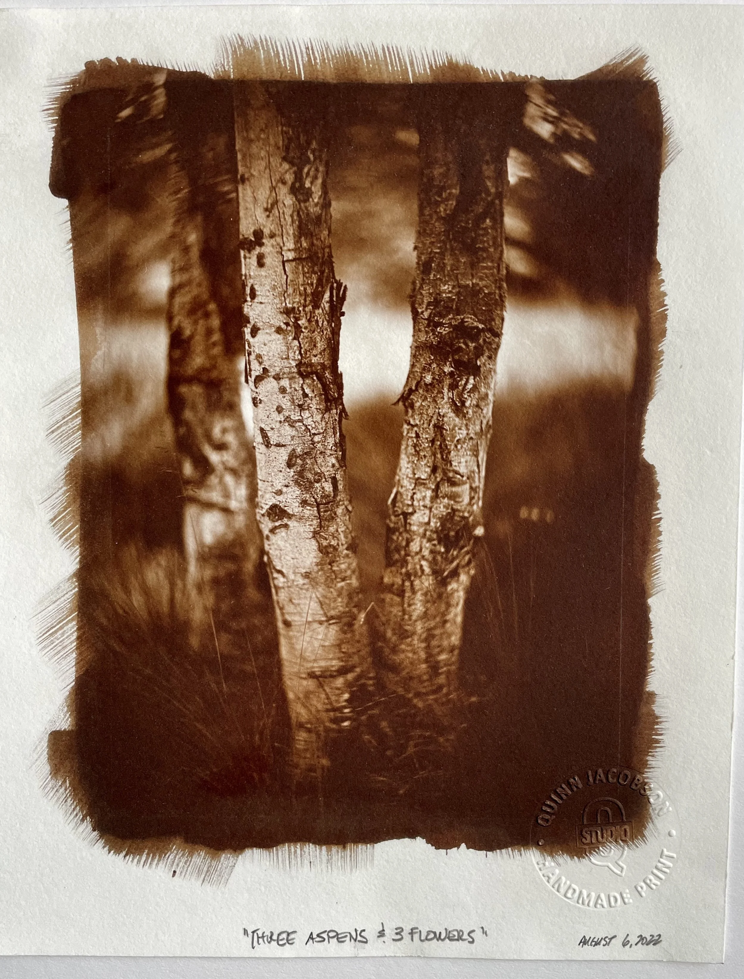
I’m currently working in the Whole Plate format (6.5” x 8.5” - 16.51 x 20.32cm). It’s a period-correct format, popular in the middle of the 19th century. And it’s a beautiful format to look at and to work with. However, I’m thinking about working in the Half Plate format (4.25” x 5.5” - 10.79 x 13.97cm). There are two reasons for this. The first is aesthetics. My 19th-century optics are mostly designed for this format. Plates made with these lenses look stunning. Period. And secondly, it would allow me to make books (handmade) that are 8” x 10” (20.32 x 25.4cm) and the images would sit nicely in portrait or landscape orientation. No limitations on what I want to say photographically.
It seems counterintuitive to go smaller, doesn’t it? When everyone wants bigger, bigger, bigger and I’m saying smaller, smaller, smaller. Why is this? I think it hinges on my desire for this work to be intimate, to be personal to the viewer. That’s the reason I want to make a book, or books, of the work too. It assures two things; the work will always be together and seen as a narrative, not one-off pieces. As well as preserving the integrity of the permanency of the work. And, it would be a lot more archival presented and stored this way.
I’m going to make a few negatives and prints in this format and live with them for a while. If it works, I’ll make it happen - all Half Plate work. If it doesn’t, I’ll keep going with Whole Plate.